Jun 05, 2020
47 secs
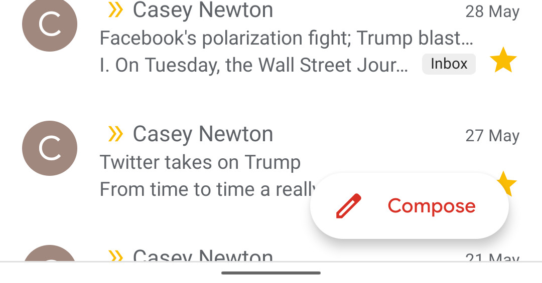
First spotted by 9to5Google, the old button, a small “floating action button†with a plus in it, is now an oblong button containing a pen icon along with the word “Compose.†It minimizes into its old circle shape when you scroll down your list of emails.
I’m sure that Google’s floating compose buttons — which it uses across other G Suite apps like Drive and Docs — are the result of hours of testing that show that users easily find buttons when they’re positioned on the bottom right of the screen?
When I do need to write the occasional new email from my phone, my brain expects the compose button to be on the top of the screen with the rest of Gmail’s controls and my newest messages.
The bottom-right of the display is also where my thumb tends to hover when it’s not directly interacting with the screen, thus obscuring the button.